Melodic Design
In developing a new card system for the homepage of the San Francisco Chronicle (2017-18), we thought it would be a fun challenge to conceive a unique classification system that we could use to talk about and apply rules to our designs. As many of us are music nerds, we decided music theory might provide an interesting lens.
Here are the beginnings of a concept we call Melodic Design:
Notes
Notes are core elements of news content: text, image, audio, video, etc
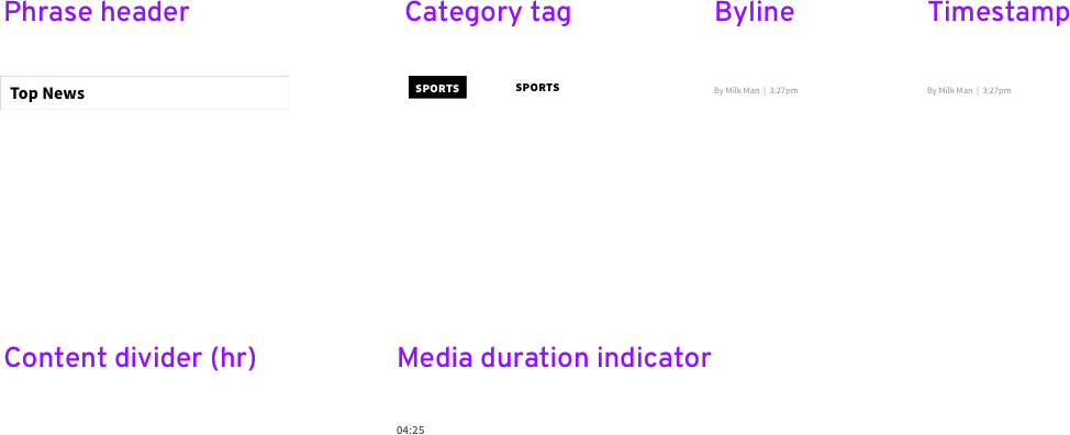
Ornaments
Ornaments are non-news content information. Section headers, tags, labels, etc
Dynamics
Dynamics are affordances and interactive elements. Anything that provides utility or information about how to interact with news content: CTAs, Icons, buttons, etc
Figures (story cards)
Notes/ornaments/dynamics are the building blocks that make up figures (story cards). Each figure represents a single standalone content experience, such as an article, a centerpage, a video, a podcast, etc
A successful figure contains:
Pitch - a distinct voice
Rhythm - dynamic variety
Harmony - complements surrounding figures by adhering to the same structural rules, buts also by providing contrast when appropriate.
Phrases
individual figures are combined to form phrases. A phrase should be a snapshot of coverage around a single story or topic, or can be used to set the pace of a news cycle (single story, slow news, lean back, etc).
A phrase will often follow a call-and-response type of cadence wherein the initial figure is followed by a run of corresponding figures (think featured story and related headlines).
Some phrase types as they might appear on a section front:
Melodies
Phrases, when they follow one another on a page, begin to form melodies. Some things to consider when constructing melodies:
Tempo: how quickly should a reader move through the experience?
Beats per measure (pacing): what is the optimal content density for the experience?
Update
We have since replaced Melodic Design with a new design system intended to serve a wider set of news properties. But much of the core ideology has informed, and continues to guide, the current system.


