Optimizing Checkout
Defining a new system
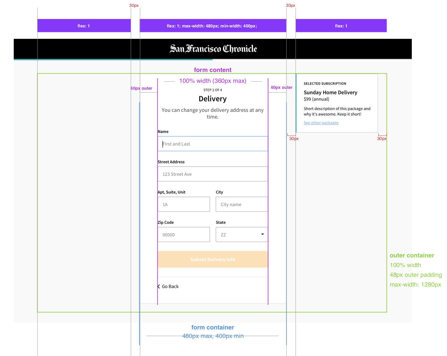
The scope of this project was narrowly defined as an optimization of the existing checkout flow. But in order to get as much out of the project as possible I decided to create a new design to support our subscription management platform as a whole, which was desperately in need of some UX attention. I worked closely with a developer to implement this redesign as a highly repeatable and scalable design solution.
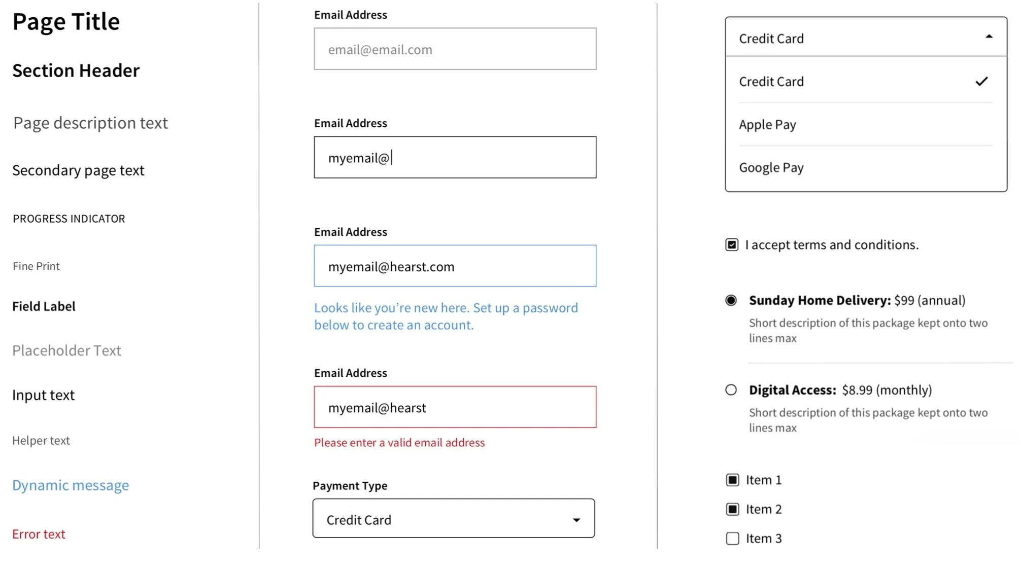
Note: text styles shown in the examples on this page use Hearst’s default font stack. Live examples employ brand-specific fonts, which are dynamically scaled using a rem-based configuration system.
Optimizing the flow
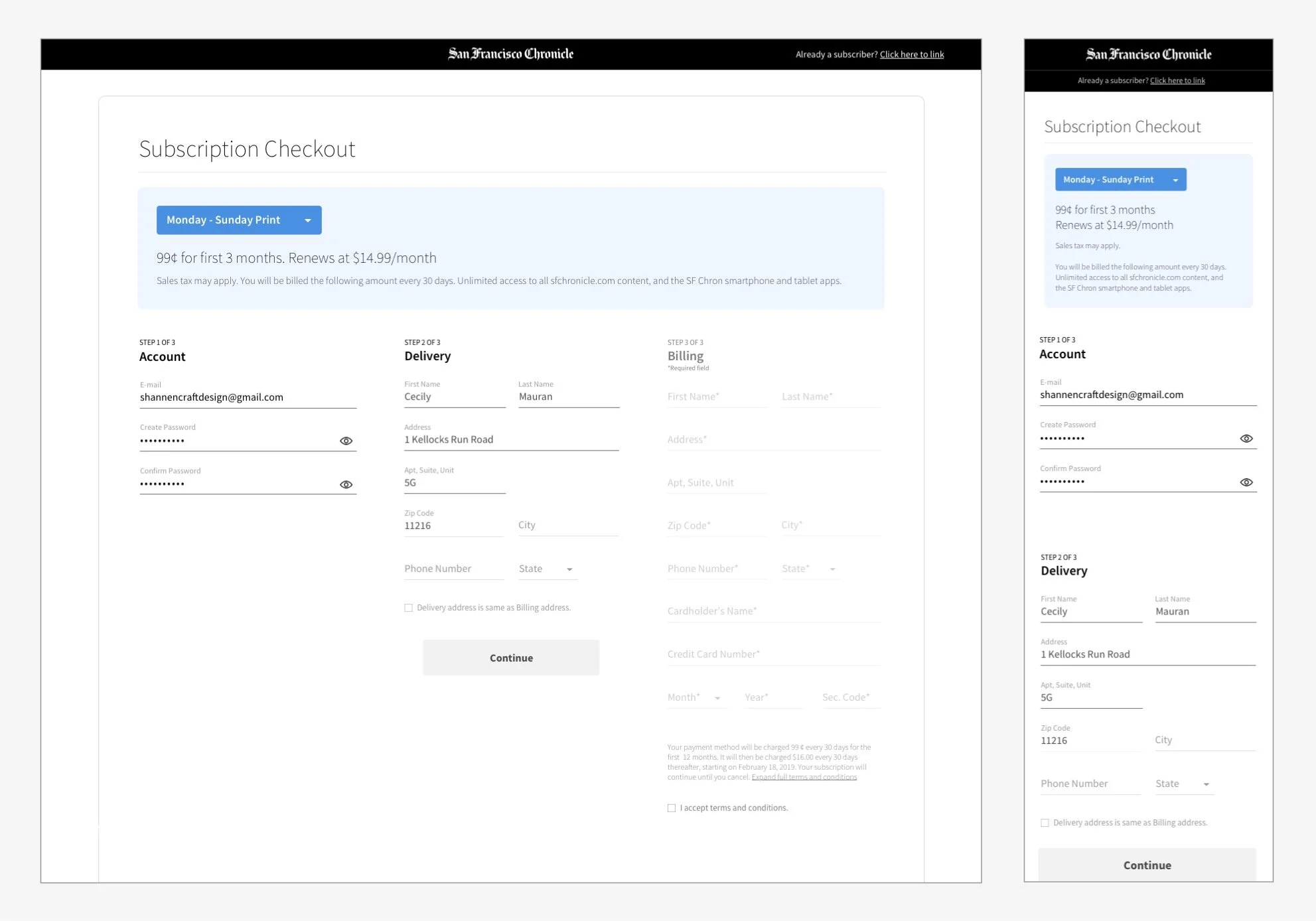
In the previous implementation, users were shown the flow in its entirety before even beginning the checkout process. Our hunch was this was causing a cognitive overload, leading people to get overwhelmed and bail.
Usability testing confirmed that suspicion, and quantitative data directed our attention to the very first step in the process, where the experience was suffering the most significant drop-off. This was exacerbated on mobile layouts where the first step in the process often landed below the first viewport.
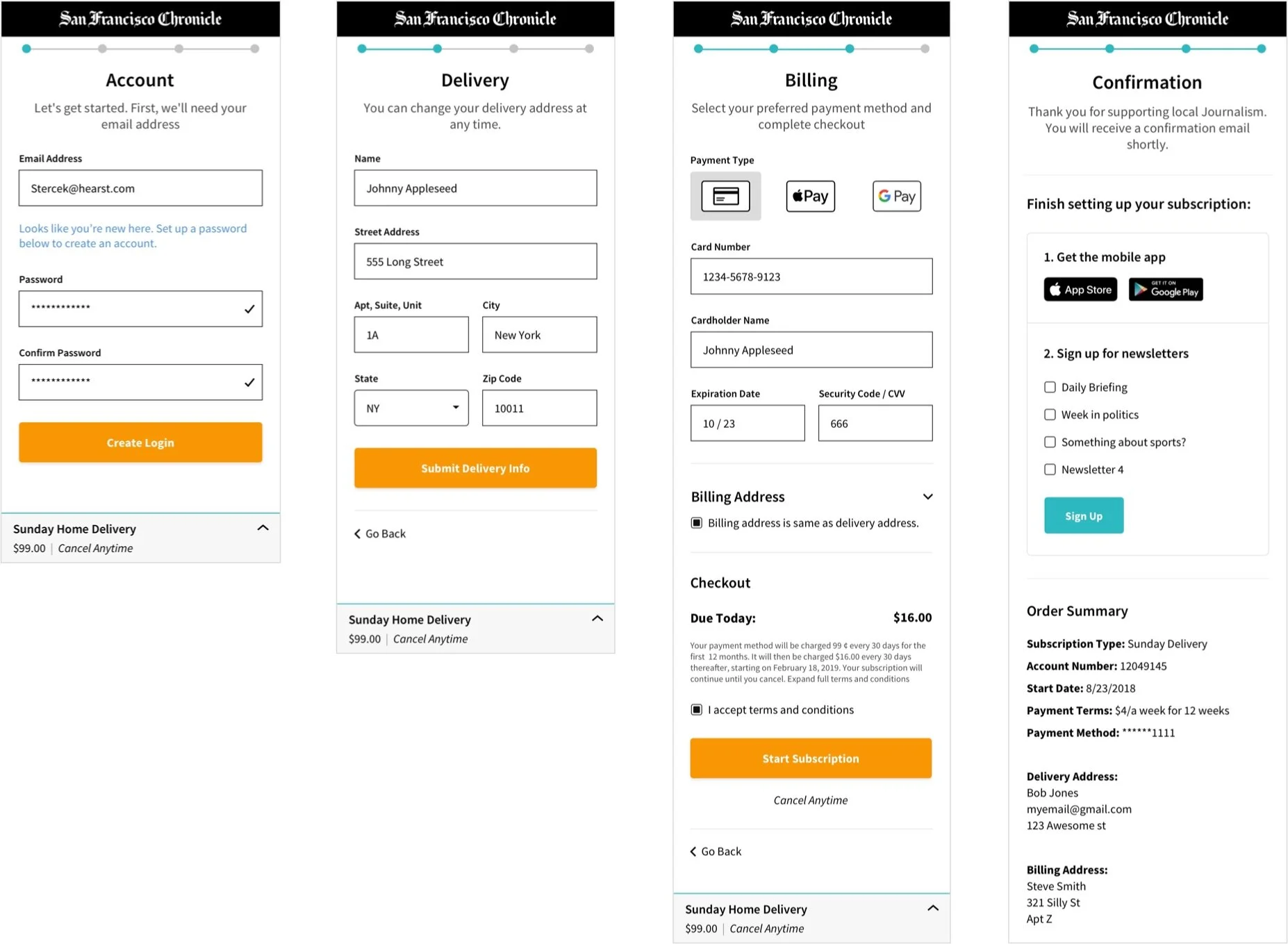
The original screen offered far too much information at once. It was difficult to read, the hierarchy was backwards, the language was cold and unhelpful, and the UI lacked helpful affordances.
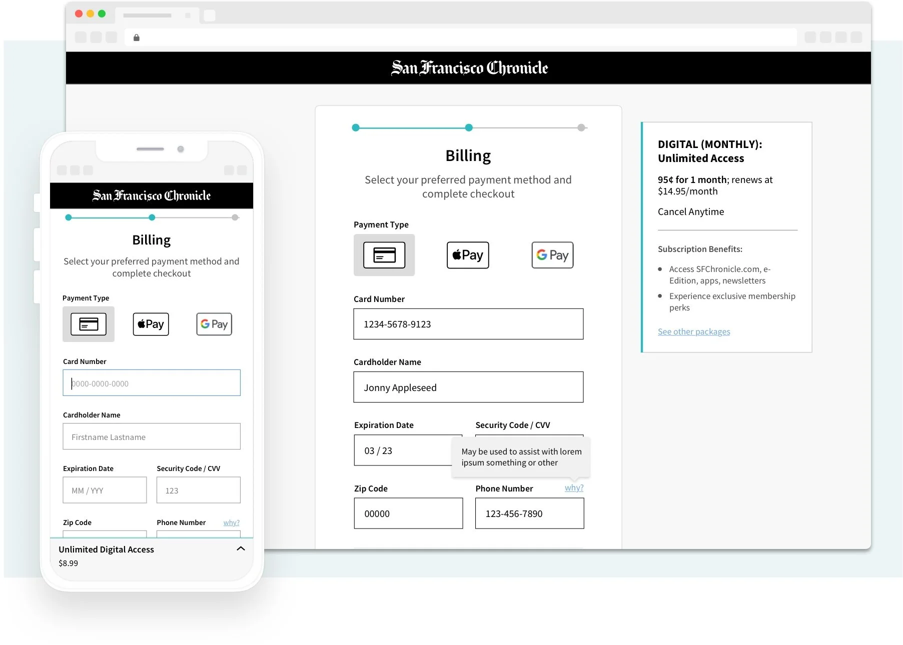
So I simplified the flow and attempted to direct attention to the most important action at any given moment. I separated the process into a series of discreet, easily-digestible screens. This created a gamifying effect on the UI, which I attempted to highlight with the inclusion of a simple progress tracker at the top of each screen.
Results
This was a huge success. We saw a 54% lift in conversions for users who entered the flow on mobile. That said, it’s not finished! There are some additional changes we’re planning to make shortly, namely leading with alternative payment methods.
